Zint
Reinventing a Brand
Creative direction
Art direction
Brand identity and tagline
Visual identity
Packaging design
Tone of voice
Social media strategy
Copywriting
Challenge
Zint found itself without a clear identity in an increasingly competitive category. Because the collagen market at the time was aligned with the general protein supplement market, most brands had standardized around unisex fitness-oriented branding. What Zint needed was a reinvention to increase its shelf appeal and connect more deeply with its customer base.
Result
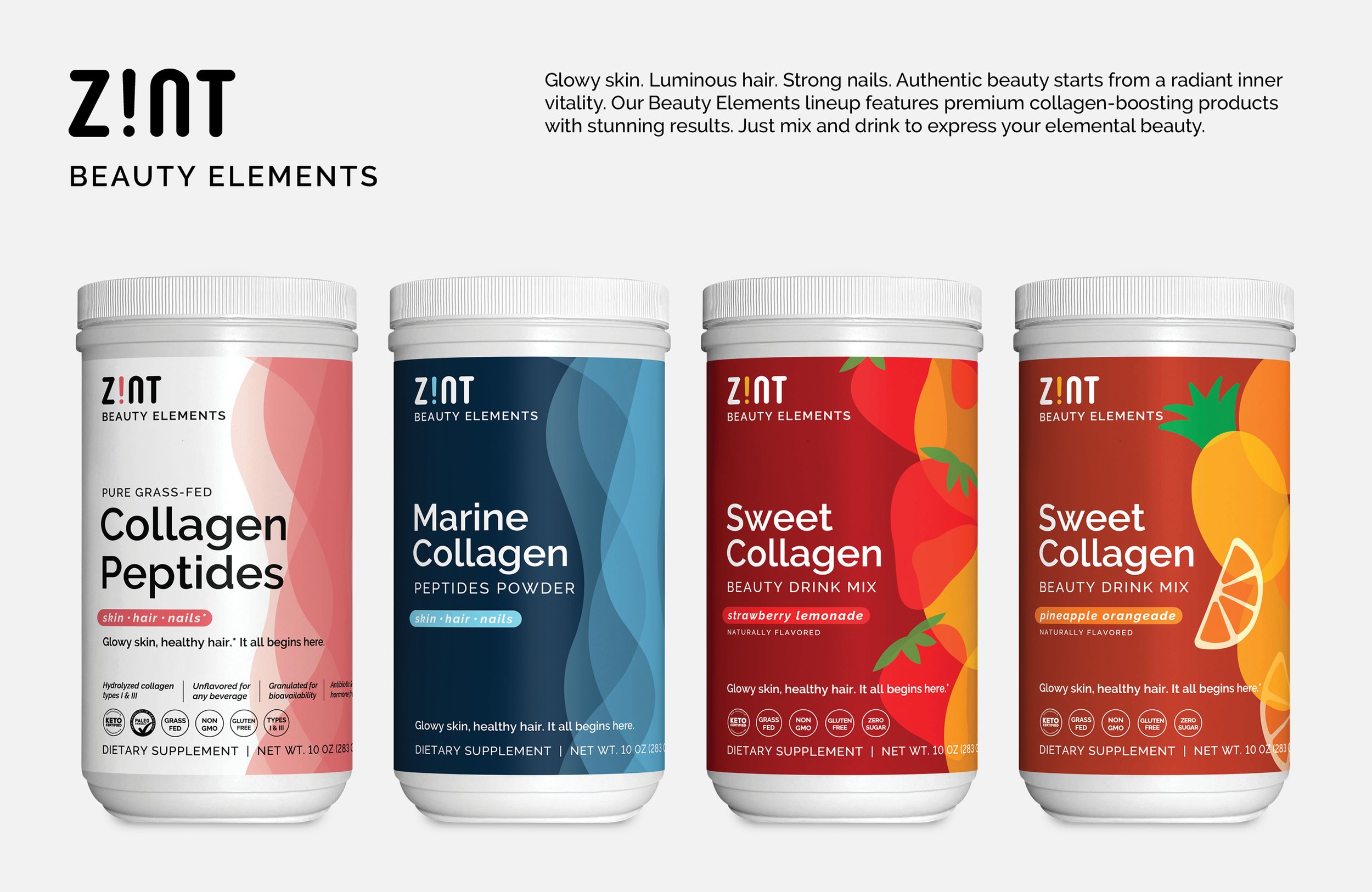
Considering the market’s predominant fitness-oriented branding, we realized that collagen’s biggest audience—women interested in beauty and anti-aging—was largely being missed. Amid imagery of dumbbells and cows, our strategy drew inspiration from an unlikely source: the wave of fresh, social media-focused indie beauty brands that were upstaging the establishment. Beauty is elemental. Zint’s new identity embraced a holistic view of beauty through nutrition, a concept novel to the Western beauty industry but with long precedence elsewhere. The refreshed visual language referenced Zint’s legacy designs while taking bold new steps toward a modern beauty paradigm, with new typography, flowing organic lines, playful colors, and layered patterns of translucent iconography. The years following Zint’s rebrand saw many competing brands following suit with an influx of beauty-themed marketing.


